Options in “Green” Floors

5Options_Green_Floors.jpg

By Tammy Adamson-McMullen


If you’re in the market for new floors and want your home to be “green” from top to bottom, you’re in luck: “Green” flooring options are plentiful in 2019! Flooring companies increasingly are using sustainable and recycled materials in all types of flooring. And over the years they’ve greatly improved their manufacturing processes to eliminate toxins and produce fewer VOCs.

Here are some of the “greenest” choices to consider:


Bamboo


No discussion of eco-friendly floors can exclude bamboo, one of the “greenest” of flooring options. Bamboo is sold as a hardwood but is actually is a grass that replenishes itself. Each bamboo plant sends up shoots that grow quickly and can be harvested without killing the parent plant. For this reason, bamboo is extremely sustainable. It also is hard and durable, making it a perfect choice for active families with children and pets.

To purchase the “greenest” flooring in this category, look for bamboo that is grown without fertilizers or pesticides and is VOC- and formaldehyde-free in its manufacturing and finishing processes. Also check if the bamboo is certified through the Forest Stewardship Council (FSC). Hailed by environmental groups, FSC offers certification for cork and hardwoods, too.

Cork


Cork is another highly sustainable product. Cork is harvested from the outer bark of standing trees, which are able to regrow the removed layer. To create cork flooring, manufacturers grind up the cork, compress it and bond it with resins. The result is a product that is durable like bamboo but surprisingly soft underfoot. Cork offers additional eco benefits:

·         Cork has special antimicrobial properties created by alternating layers of wax and suberin (a rubbery polyester biopolymer). These protective layers resist the growth of mold and mildew and repel insects.

·         Cork is hypoallergenic—repelling dust, hair, etc.—and actually improves indoor air quality.

·         Because it has millions of air-filled holes, cork is highly insulative and can actually reduce energy costs.

One note of caution: Because cork is an organic material, it can rot in standing water. So avoid putting it in “wet” areas, such as bathrooms and leaky basements.
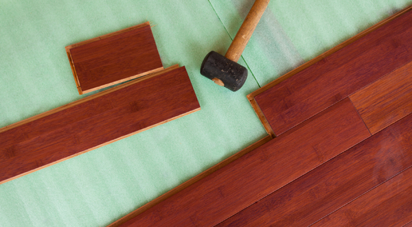
Hardwoods

One eco-friendly advantage of hardwoods is that they last a long, long time. However, not all hardwood floors are created equal. To make the “greenest” choice, avoid rare and exotic woods and choose from those in more abundance, such as oak, maple, cherry, walnut and pecan. Pine is another great option because it grows more quickly than other deciduous trees.

Regardless of wood type, make sure that the wood flooring you’re considering has been sustainably harvested, was manufactured with non-toxic adhesives and finishes, and is low in VOCs. To be “greener” yet, consider engineered hardwood rather than solid wood flooring, which has more wood in the final product.

Carpets and Rugs

This category has many natural, renewable materials to choose from, including organic wool, organic cotton, jute, sisal, seagrass and coir. Organic wool in particular has become a very popular carpet choice and—like hardwood floors—can last a lifetime if cared for properly.


Whatever the material, be sure to purchase the highest-quality carpet you can afford. Additionally, look for a label by the Carpet and Rug Institute’s (CRI) Air Quality testing program ensuring that the carpet has passed low-emissions standards. Choose carpet pads that are made from natural materials—felt rather than styrene-butadiene rubber, for example—and ask installers to use a non-solvent adhesive.


Resilient/Laminate/Linoleum


Can resilient, laminate and linoleum floors really be eco-friendly? In a word, yes! Many of today’s products are lower in VOCs—a feat achieved through eco-friendy printing and adhesive processes—and made from renewable materials and recycled content. As a quick primer, resilient flooring is a combination of natural and synthetic materials. Laminate flooring has a hard, printed laminated surface and a fiberboard core bonded with melamine resins. Linoleum is made entirely from natural, biodegradable materials.


When selecting from this category, consult with your retailer to make sure you’re getting the “greenest” product available. You might also look for LEED  (Leadership in Energy and Environmental Design) certification, one of the most widely used “green” rating systems in the world. And again, make sure installers are using eco-friendly products and practices.

Tile

Recycled tile is getting a lot of attention these days, and for good reason. Tile manufacturers increasingly are making beautiful and durable products from renewable and recycled materials, such as scrap glass, scrap ceramics and porcelains, fine residues leftover from industrial sand processing and more.


But tile in general is an eco-friendly choice. Arizona Tile makes a convincing argument for this point on its website, noting that the majority of tile manufacturers have “closed-loop” facilities that reuse materials and water. Additionally, because tiles are kiln-fired at very high temperatures, they don’t emit any VOCs in the spaces where they’re installed. And since tile is manufactured throughout the United States, the product can be locally sourced rather than being shipped from overseas—thus reducing its carbon footprint. Last but not least, tile is virtually maintenance-free and usually can be cleaned with nothing more than water. The bottom line? It’s fairly difficult not to be “green” in this category!

Grasscloth Makes a Comeback

Why a staple from the 1960s and ’70s—grasscloth wallcovering—is making a comeback.

Why a staple from the 1960s and ’70s—grasscloth wallcovering—is making a comeback.

By Diane Franklin


If your last encounter with grasscloth wallcovering was in the 1960s and ’70s, you’re in for a pleasant surprise. Grasscloth is back—and in many ways, it’s bigger and better than ever.


Grasscloth is part of a natural trend in decorating which favors the use of environmentally friendly materials. It is a lightweight wallcovering made from natural materials, such as seagrass, hemp, jute, arrowroot or reed, that are woven together using cotton threads and adhered to a backing that is most often rice paper.


Today’s fashionable grasscloths have been updated considerably from the grasscloth of old. Where color variety in the past was generally limited to neutral colors, today’s grasscloths are in a variety of colors—some even infused with metallics and incorporating more interesting weaves. Thinner weaves typically provide a cleaner, more modern look, whereas thicker weaves provide a more traditional—and in some cases, rustic—look.


Using Grasscloth in Home Décor


Grasscloth is a product that seems to meet a variety of trends. It fits the trend toward biophilic design, which is characterized by bringing natural materials indoors. It is a sustainable material that fits consumers’ trend toward being more environmentally conscious. At the same time, it fits a trend toward textured home décor products, including the use of texture on the walls.


Because of the delicate nature of grasscloth, it’s important to be judicious in where you use it. It obviously is not meant for high-traffic areas like kitchens, family rooms or hallways. Your best bet is to use it in low-traffic areas where a touch of elegance is desired, such as formal living or dining rooms. It also works nicely in bedrooms and home offices.


In addition, grasscloth lends itself to the trend toward focal walls, since it offers a sophisticated, eye-catching appearance. Another great look is to use grasscloth above wainscoting, with the use of paneling underneath.


Keep in mind that grasscloth is different from other wallpaper in that you aren’t going to get a pattern match from one piece to another. That is part of the natural look and should not be considered a defect.


Color Variety


There was a day when the natural composition of grasscloth was thought to pair up best with only natural-inspired colors—i.e., neutrals such as beige, brown or muted yellow. But today’s grasscloths literally come in a full spectrum of colors. You can go bright, you can go bold, you can go shimmery or shiny.


Of course, natural colors still are popular in keeping with natural environmental trends, but that’s only where the grasscloth color scheme begins. You will easily find today’s grasscloths in on-trend gray for a super-elegant or industrial look, but you can also find grasscloth in bronze, gold, green, indigo—even vibrant red.


An Imitation Look


If you want the look of grasscloth in a higher-traffic area, such as a family room or high-traffic entryway, there are imitation grasscloth wallcoverings that will fill the bill. The imitation grasscloths provide the advantage of being easier to clean and maintain. Because they are made of a more durable material, they stand up to more wear and tear just like other non-natural wallpapers do. You can also use these imitations in higher moisture areas, such as bathrooms, where the use of real grasscloth is inadvisable.


Another advantage to these faux grasscloth wallpapers is that they are less expensive than authentic grasscloth. And because of advancements in technology, they look indistinguishable from the real thing.

DIY or Contractor?

Should you tackle that painting job yourself or hire a professional?
Here are points to consider

By Tammy Adamson-McMullen

2DIY_or_Contractor.jpg

Like many consumers, you might have toyed with the idea of tackling a painting project yourself—maybe to save the costs of hiring a professional painter. But before you reach a final decision, there are important points to consider. And not all of them involve money.


Abilities


First, it’s important to be honest with yourself: Do you have what it takes to produce a satisfactory end result? If you answer “yes” to most of the answers below, then a DIY painting project might be in your future. If not, it’s probably time to call a professional.


·         Patience: Patience—or endurance—is one of the most important skills in painting. Do you have the patience to plan the project from start to finish? To prepare the surface to be painted, such as washing walls, filling nail holes and gauges, sanding uneven surfaces, masking abutting walls and trim, and priming? To work slowly and meticulously until the project is complete? To wait for the paint to dry between coats? And to properly clean up your work area and tools?


·         Fine Motor Skills: You don’t have to be Van Gogh, but it’s helpful to have a modicum of skills. Can you properly hold and manipulate brushes and rollers? Can you lay painter’s tape in a straight line? Can you “cut in” corners and small areas? Lay on even coats of paint? Avoid major spills and splatters?


·         Strength: Painting can be physically demanding, although proper tools definitely help. But it’s worth asking: Do you have the strength to move furniture out of the way? To lay tarps to protect flooring and furniture? To pour paint into trays? Can you carry and climb ladders? And bend over for lengths of time?


Project Scope


Many DIYers have no qualms about painting a small room or focus wall. But what about larger and more complex projects, such as finishing kitchen cabinets or painting a two-story exterior? Before starting any project, do your research to understand its scope—products that are needed and steps involved. Watch YouTube instructional videos that show similar projects, do extra reading on the Internet and discuss the project with your local paint retailer. A paint retailer can help plot the project and can suggest everything you’ll need—which might include renting additional equipment, such as a power sander, pressure washer, paint sprayer or scaffolding.


DIY Budget


There’s no doubt that doing a project yourself saves money (unless you make a mistake that requires a do-over). But don’t go overboard by skimping on paint and tools. Purchase all the products you need—putty knives, spackle, sandpaper, brushes, rollers and trays, masking tape, tarps, stirrers and so on—so that you can work without interruption. And buy the best quality you can afford, to ensure a smooth application, beautiful end results and a lasting finish.   


How much can you expect to spend? According to HomeAdvisor.com, the average cost of painting a 10-by-12 room ranges from $200 to $300. To calculate the square footage of the paintable area so that you buy only the paint you need, add together the length of all the walls to be painted and then multiply that number by the height of the room (floor to ceiling). Generally speaking, one gallon of paint will cover between 350 and 400 square feet. Before purchasing paint, discuss the dimensions with your local paint retailer who can ensure that you purchase the right quantities.


You’ll additionally need primer if you’re painting over drywall or dark walls, and you may need an extra coat of paint, too, depending on the product you’re using. Remember: Better-quality paints provide better coverage. Depending on your project, it might be worthwhile to splurge on a high-end product that combines a primer and coating in one, or that totes its one-coat coverage benefits.


Professional Budget


You’ll need a larger budget if you plan to hire a professional painter, but you won’t have to lift a finger to achieve gorgeous results. When selecting a candidate, gather estimates from three or four painters and check references. Inquire about the paint brand they generally use, and if it’s not a brand you like or are familiar with, ask if they are willing to change. Make sure you understand the estimate they provide—does it include moving furniture, for example?—and ask for clarification if necessary.


Painters generally work by the hour, although they sometimes charge a flat fee for smaller projects. HomeAdvisor.com notes that the average cost of hiring a painter for a 10-by-12 room is $380 to $790, not including ceiling, trim or the cost of paint. The average cost of hiring a painter for a home exterior is $2,700 for a single-story home, but it’s not unusual to pay upwards of $6,000 for a multi-story home with multiple colors. And again, these costs don’t include products. Cost variations depend on the painter’s experience, how many coats and colors are required, the complexity of the project, etc.


One last note: If you want to hire a professional but are keen on saving money, consider tackling the surface preparation yourself. Some painters are willing to let you do this—as long as you’re fastidious in doing the work properly. Happy painting!

The Psychology of Color ~ Diane Franklin

The colors you surround yourself with can affect your state of mind.

The colors you surround yourself with can affect your state of mind.

Excitable red, calming blue, optimistic yellow, regal purple—it’s true. The colors in your life have an impact on mood—even to the point that they can stimulate or depress your appetite.


Nowhere is color’s impact more apparent than in your home, where the paint on your walls can quite literally bring you such emotions as comfort, cheeriness, serenity and wellbeing. The colors you select for wallpaper, flooring, draperies, bedspreads, cabinets, countertops and molding have similar potential to shift your mood. Here are some interesting tidbits about how the colors you use in your home can improve your state of mind.


Calming Colors


Several colors are associated with peace and serenity, thereby offering a welcome retreat from the stimuli of the outside world. Blue is among the most soothing of colors. Think of the gentle waves of the ocean, the sky on a cloudless summer day, or the eyes of a newborn baby. The emotions that blue evokes makes it the perfect color for a bedroom, a master bathroom or a quiet nook for reading and meditating. And if you have a beach house, a blue motif works well throughout the home as a compatible décor for your surroundings.


Another color that lifts your mood is green. Just think about days spent in your garden or walking through a local park. The greenery of the grass, trees and foliage helps you feel more refreshed and can actually alleviate stress. Using green in your decorating—whether paint on the walls, an area rug on the floor or plants near your windows—is a great way to feel better about life.


Other colors that offer soothing qualities are neutrals such as gray, beige, taupe and off-whites as well as pastels such as light pink, soft yellow, mint green and a whispery lavender. Warm wood tones also offer a sense of coziness and serenity.


In the Pink


Are you looking for a color that reduces negative emotions? One color that has been scientifically proven to do so is pink. In fact, color researchers in the 1970s conducted an experiment using pink to calm angry and antagonistic behavior among prison inmates. They painted the walls pink, which produced a calming effect (though the effect did lessen once the inmates got used to the color).


In small doses, pink can be a wonderful color in many areas of the home—not just for baby girl nurseries but for older girl bedrooms, powder rooms and guest bedrooms. If you want to tone down the pink, you can pair it up with other colors like gray, teal, bright red or orange.


An Appetite for Color


Ever wonder why fast-food restaurants use so much orange and red in their signage and décor? Why, to stimulate your appetite, of course. Those marketing experts don’t miss a trick!


Color researchers have known for years that reddish hues are more conducive to a healthy appetite. Conversely, blue is an appetite buzzkill. Good thing to know if you’re dieting! But it’s also good to know when considering colors for your kitchen or dining room. If you want your casserole surprise to delight the taste buds of family and friends, any other color but blue is the way to go.


Size is Relative


Color psychology isn’t only about hue but also about lightness and darkness. Light colors can make a small room feel more spacious, whereas dark colors can make a cavernous room seem smaller and cozier. Your eye plays a helpful trick to change your perception of the space, but the colors also evoke a certain psychological feeling that can change your mood when entering a space where the size might otherwise be confining or intimidating.


Excite Your Surroundings


Being calm, peaceful and serene is all well and good, but sometimes you need a little excitement in your life. Red is a color that experts associate with energy, excitement and passion. Orange is similarly a color that pumps up the energy in a room. For your home, you might want to use these colors in small doses for accents, accessories or focal walls. Or you may wish to get bold by using the colors in an area where a lot of energetic activity is taking place, such as a rec room or a man cave.


A word of caution, however: It’s best to avoid the most intense of these colors if you’re prone to stress, since colors like red have been clinically proven to increase adrenaline.

How to mix it up with a monochromatic design

Going monochromatic doesn’t mean your room will lack variety or flair.


Color is one of the most effective ways to express yourself and your personality, so why would you want to go with a monochromatic decorating scheme? Wouldn’t that be safe, drab and—the worst sin of all—boring? Actually, going monochromatic doesn’t mean your room will lack variety or flair. Done right, a monochromatic décor can be sophisticated, soothing, and quite distinctive.


Monochromatic color schemes allow you to achieve an interior décor that is cohesive and easy on the eyes. A major advantage of this type of palette is that you’re less likely to make mistakes: no worries about whether your complementary or split-complementary color plan is too jarring to the eye. If you have an open floor plan, staying within the parameters of a monochromatic color scheme can give you a nice flow from space to space.

Monochromatic.jpg


Build Interest With Texture and Pattern

The most successful monochromatic schemes typically involve the use of a neutral color that’s rendered in various different values—that is, a range of lightness and darkness. But keep in mind that color is only one aspect of your decorating scheme. Texture, sheen, and pattern also are effective ways to add visual interest and sophistication to a room, and they can be particularly effective in a monochromatic color scheme.


If you’ve built your room around a taupe scheme, for instance, pattern can help you use the color in unique and eye-catching ways. A paisley print on your throw pillows, featuring closely aligned colors, will add a nice decorative flourish to your sofa. A floral or geometric pattern on an area rug, rendered in a moderate shift from your chosen color, is a beautiful way to pull your color scheme together.


Use a pattern on the wall to add interest within your chosen color scheme. Wallpaper will allow you to introduce pattern, texture, or contrasting sheens to a single feature wall or even to the entire room. Similarly, you can create a painted wall treatment that adds pizzazz to your monochrome scheme. For example, a tone-on-tone striped effect with subtle shifts in color and sheen can add just the touch of sophistication you’re looking for.


Texture is another important element of a monochromatic color scheme. You can use texture in various elements of the room—for instance, a plush area rug, a woven window treatment, multidimensional wall tiles, a faux-brick wall finish, or carefully chosen accessories (more on those below).


Accessorize Like a Pro

Accessories are a great way to make your monochromatic décor more distinctive. A glass and chrome accent table, a tall floor vase in a unique material such as galvanized metal or concrete, a piece of rough-hewn pottery, or multimedia wall art will add an element of texture. In a monochromatic color scheme, your accessories are a way to add some color—for instance, with some greenery or blooms in your vases or a multicolored art piece hanging above the fireplace.


Finally, light is a way to make your monochromatic décor quite literally shine.  Distinctive light fixtures and lamps add a nice element to the room, and you can use track lighting to highlight a specific area or decorative element. Natural lighting is another great element to feature in a monochromatic room. Make sure your window treatments can be easily lifted or drawn to the side to add a light and airy feeling to the surroundings.


How to resolve decorating disagreements


A few trade-offs can result in a design that makes everyone happy.


You say, “Wallpaper.” I say, “Wall texture.” You say, “Carpet.” I say, “Hardwood.” Before you call the whole thing off, recognize that compromise might be required to resolve disputes over home décor. Whether you’ve just purchased your first home or are finally getting around to redecorating after decades, you may find that those diverse views that make life interesting in the best of times add heat to discussions over design decisions. Keep in mind that differences over decorating are common, and a few tradeoffs can result in a striking décor that makes everyone happy.

Disagreements.jpg


You’re in This Together

When two people share a dwelling, what makes it their home is a concerted effort to reflect the combination of styles and interests. If a major disagreement arises over interior design, a first step may be to look for common, or at least complementary, ground.


Start with the palette: A visit to Tommy's Paint Pot will offer a wealth of color schemes and wall-finishing options from which to choose to form the backdrop of your décor. Next, compare furnishing styles. If your tastes run to classical and your partner prefers modern, you may be able to find some elements of each style that offer a starting point for discussion. Spend some time browsing decorating sites, shows, and magazines to identify rooms that you like. You’ll also have plenty of opportunities to talk about why you like this and why your partner likes that, which may provide some insights into the emotional aspects of decorating preferences.


Shopping and making these decisions as a team makes it more likely that both of you will feel involved and pleased with the outcomes. Speaking of shopping, that’s another area where there may be some disagreement. You may love to shop—the more choices, the better—whereas your partner hates it, or vice versa. In that case, one solution is for the shopping pro to make some scouting trips, return with paint and wallpaper samples and fabric swatches, and then schedule return visits to the stores most likely to yield maximum results with a minimum time commitment from the non-shopper.


It Doesn’t Have to Be Either/Or

Combining your decorating preferences and treasures can yield a décor that’s fabulous and uniquely yours. Style, function, and comfort aren’t mutually exclusive. An antique cupboard can command a place of honor in otherwise modern surroundings.


Going room by room is another strategy. If one of your style preferences dominates in the living room, the other person could make key design decisions in the kitchen. And each of you can have your own spaces on which to place your stamp by choosing favorite colors, furniture, and belongings to showcase in a den, sewing room, or hobby haven.


Some rooms can be designed for double duty: The basement man cave may occasionally be rearranged to make room for a big family get-together. The home office can double as a display for that prized collection that used to grace a living room.    


A Little Empathy Goes a Long Way

People have strong attachments to their belongings and sense of style. It may be hard to agree that a cherished collection of salt and pepper shakers or sports memorabilia would clash with a new living room décor. Acknowledging the pangs that arise over such decisions and appreciating each other’s willingness to compromise are crucial steps in creating surroundings you can both call your own.

Quarters Fall-Winter 2017

The latest issue of Quarters Magazine is in!

Quarters is published by the Paint & Decorating Retailers Association (PDRA) and brought to you locally by Tommy's Paint Pot.  Be sure to check out page 27, Colors & Moods which includes expert advice from our own Marcy Beard.  Printed copies are available in our stores while quantities last, or you can peruse the magazine within your web browser below.